
The first report out of my new accessibility checker told me that every interactive control on this site was missing a focus ring. All of them. Buttons, links, form fields, the lot. I sat with that for a minute and felt appropriately terrible about it, then went and pressed Tab on my own homepage, where a perfectly good focus ring showed up exactly where it was supposed to be.
So that was the shape of the week: I built the thing that grades the site, then spent the first chunk of it grading the grader. Three tracks, all knotted together, and a fair share of the work went into making a tool nobody asked me to build stop telling me things that were false.
Running an accessibility sweep across 488 pages
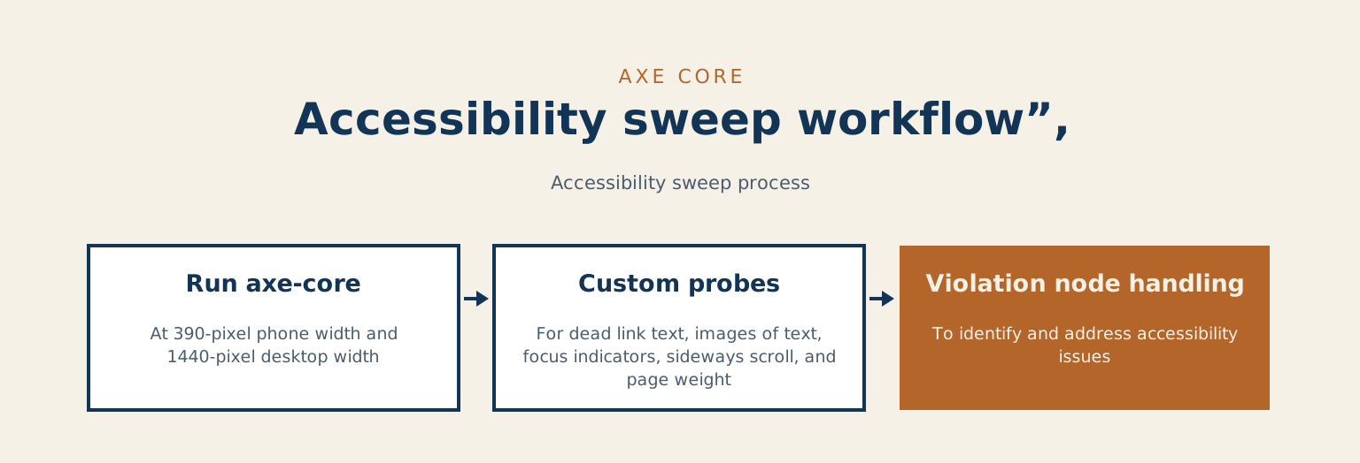
Monday went to a site-wide sweep: every public URL, all 488 of them, loaded once. Each one ran through axe-core twice, at a 390-pixel phone width and a 1440-pixel desktop width. Then it runs a handful of my own probes for what axe stays quiet about: dead link text, images of text, focus indicators, sideways scroll, and page weight. It handed back around 280 violation nodes that had been shipping quietly for months. Not because anyone decided to ship them. Because nothing was looking.
Which brings us back to the focus rings. My probe called focus on each control from a script. A browser only paints a visible ring when it thinks a keyboard put you there. Scripted focus fails the check every time, quietly. The fix: stop being clever, press actual Tab keys.
The second bug I liked even more: the sweep measured the homepage the instant it loaded, caught the hero mid-fade and reported a contrast ratio of 1.01 to 1. The headline was not invisible, it was just shy for a few hundred milliseconds. Now it waits for entrance animations to settle before it measures anything. The third bug was my own reading problem. I was checking the text inside each link, so an image-only card link came back blank. Its name was sitting in the alt attribute the whole time. It reads the nested alt now. It skips Turnstile internals, native audio, and iframe controls on purpose. The browser paints those, not my code.
Folding the sweep findings back into the rubrics
Findings that stay in a report are just a report, so the afternoon went into the rubrics my own drafting and design work gets graded against. Real anti-patterns, taken from real failures: text dimmed with opacity, a colour token reused on a background it had never been checked against, a scrollable panel with no keyboard route into it. My favourite is the fonts one. An inline diagram had declared Sora and Manrope for its labels, two typefaces this site does not load, so every label fell back to a wider face than the diagram was drawn for and the text crept past its boxes. It looked perfect to me for months, because both fonts are installed on the machine I built it on.
It is deliberately lopsided, tuned to let a borderline title through rather than block a good one, and the test suite came back 12 for 12 afterward
Then an accessibility floor went into the publish prerequisites: seven checks against the rendered page, not the source, because every defect in that pile had already passed a human reading of the markup. A sweep you run once is a sweep you eventually stop running, so there is now a nightly guard: a rotating window of 70 URLs, a full pass over the site every week instead of one enthusiastic afternoon, and a failed run on any backslide.
The post whose title had nothing to do with the post
Tuesday brought a different flavour of the same problem. While clicking through pages during the sweep I found a post about my 2013 WordCamp Toronto talk, the one about how WordPress let me quit the rat race, sitting under a title so generic it hid the story. So I taught the drafting checks to spot it. The rule: three or more meaningful words in a title, none of them anywhere in the body. That draft gets capped at a shape failure and comes back to me. It is deliberately lopsided, tuned to let a borderline title through rather than block a good one, and the test suite came back 12 for 12 afterward.
What all of it had in common
Every defect I found this week had already survived a careful look at the code, mine included. Reading the markup tells you what you meant; only the rendered page tells you what a person gets, which is the same reason a ramp bolted to the side of a building can satisfy the drawing and still leave someone waiting outside in the rain. A tool’s claim about accessibility is not the same thing as a check. I learned that again when I tested whether accessibility overlay widgets actually work on an LMS. I do this same rendered-page accessibility work for other people’s sites, and if you want to try it on your own and it goes sideways, ask. I’ll help.
And in case any of this sounds like a well-oiled operation, my landing-page pipeline spent part of the same week drafting a page called “Your Moodle-to-WordPress migration needs a breakage allowance,” keyed to the search phrase “breakage allowance for tiles.” That is a flooring question. The review step refused it for being off-pillar before it got anywhere near a reader. Last week’s notes, on the week my own guardrails knew better than I did, are in the previous Behind the Scenes.