
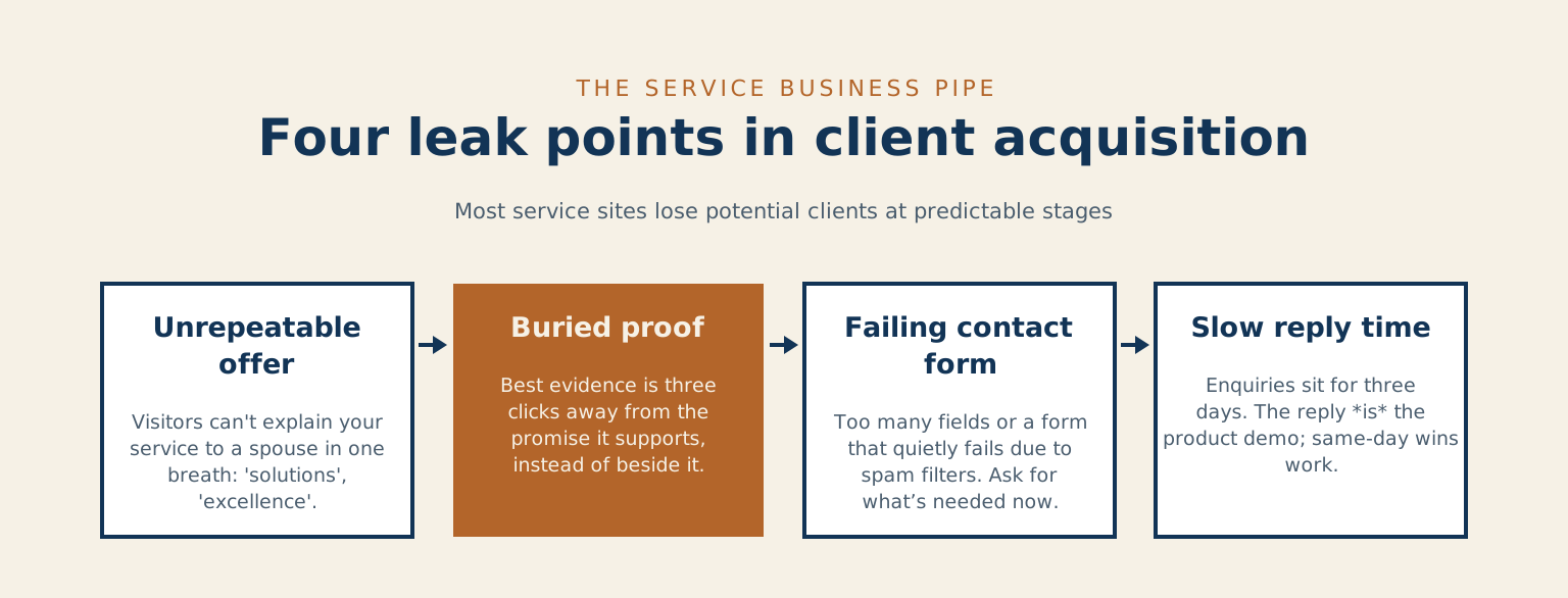
Service businesses get sold conversion optimization as if it were a paint colour: a new button, a new headline, ten percent more calls. I’ve audited enough consultant and contractor websites to tell you where the money actually goes missing, and the button isn’t where to look. A service site is a pipe that carries a stranger from “found you” to “contacted you,” and most pipes leak at the same four joints.
The short version:
- Leak one: an offer no visitor can repeat back to their spouse in one breath.
- Leak two: your best proof sitting three clicks away from the promise it backs.
- Leak three: a contact form that asks for too much, or one that quietly fails.
- Leak four: a reply that lands three days after the enquiry instead of the same day.
Find the leak before touching the paint
Leak one is the offer nobody can repeat. A visitor should be able to close your homepage and tell their spouse what you do, for whom, and roughly what it costs, in one breath. Most service homepages fail that test politely, with “solutions” and “excellence” over a stock handshake. If the reader can’t repeat the offer, they can’t compare it, and people don’t buy what they can’t compare, they just leave quietly. Nielsen Norman Group’s homepage guidance says to treat the homepage as an elevator pitch that conveys what your organization does.
Leak two is proof you can’t see
Buried proof is the second leak. Your best evidence, the before-and-after or the named review or the number that improved, usually lives three clicks deep while the homepage talks about passion. Proof belongs beside every promise: make a claim, show its receipt, in that order, on the same screen. A link out to the review helps, because Nielsen Norman Group found that people trust testimonials from external sites more than those listed on the website itself.
Proof belongs beside every promise: make a claim, show its receipt, in that order, on the same screen.
The form is where good sites die
The contact form itself is the third leak, and it leaks two ways. The visible way is friction: eleven fields, a dropdown for “how did you hear about us,” a required budget the visitor doesn’t know yet. Decades of usability research on form design keeps reaching the same unglamorous conclusion, that every unnecessary field costs completions, and yet the eleven-field form survives because it’s the business asking for what the business wants. Ask for what the first conversation needs instead, which is a name, a way to reply, and a sentence about the problem. Everything else is your curiosity taxing their patience. Stanford’s web credibility guidelines make the matching point from the other side: a simple way to boost a site’s credibility is making your contact information clear.
The failure you never see
The invisible way is worse: the form that quietly fails. Mine did, for weeks, and the inbox just looked like a slow month while a spam filter I was proud of discarded real customers. I wrote up the ten-second monthly test that would have caught it, and if you adopt one habit from this entire article, make it that one, because a broken form converts at exactly zero no matter how good the rest of the page is. WordPress’s own documentation for wp_mail() warns that a true return value does not automatically mean that the user received the email successfully, so a form can report success and still deliver nothing.
Answer like you want the job
The last leak happens after the site has done its work: the enquiry sits for three days. For a service business the reply speed IS the product demo, because the customer is imagining what hiring you feels like, and the first sample they get is how long you took to answer. Same-day replies win work from better competitors who answered on Thursday. Put the follow-up on rails, even a simple acknowledged-within-hours autoreply with a real timeline in it, and you’ll out-convert firms with prettier websites. Speed is the whole subject of James Oldroyd, Kristina McElheran and David Elkington’s “The Short Life of Online Sales Leads” in Harvard Business Review, 2011.
A worked example
One worked example before you go, because “make the offer repeatable” sounds easier than it is. Compare “We provide end-to-end digital solutions for growing businesses” with “I rebuild slow, confusing websites for Niagara service companies, most projects run four to six weeks.” The second sentence names the customer, what’s wrong, the geography, and the shape of the engagement, and a spouse could repeat it at dinner. That’s the whole bar. If your homepage can’t clear it, fix that sentence before you spend a dollar anywhere else on this list.
How long does an enquiry to your business sit before somebody answers it?
Notice what none of this is: a redesign. Fix the sentence, surface the proof, lighten and test the form, answer fast. Run that pass first, measure for a month, and only then decide whether you still need the paint. If you want a second set of eyes on where your own pipe leaks, that’s exactly what my site audits are for, and the first look is the kind of thing I’d rather you steal from this article than pay for.
Common questions about fixing a leaky service website
Do I need a full redesign to fix these four leaks? No, and that is the point of the whole piece. Fix the sentence, surface the proof, lighten and test the form, and answer fast. Run that pass first and measure for a month before you spend anything on a rebuild. When a site is broken enough that patching the joints won’t hold, that is when a rescue makes sense, not before.
How many fields should my contact form have? Ask for what the first conversation needs, which is a name, a way to reply, and a sentence about the problem. Every field past that is your curiosity taxing the visitor’s patience, and each one costs you completions.
How fast do I really need to reply? Same day. The customer is imagining what hiring you feels like, and your reply speed is the first sample they get, so a same-day answer wins work from better firms that replied on Thursday. If keeping up with enquiries is the part that slips, that is what ongoing maintenance is meant to hold, and you can always just get in touch to talk it through.
References
- Website forms usability: top 10 recommendations, Nielsen Norman Group.
- Homepage design: 5 fundamental principles, Nielsen Norman Group.
- Trustworthiness in web design: 4 credibility factors, Nielsen Norman Group.
- The Web Credibility Project: guidelines, Stanford University.
- wp_mail(), WordPress developer reference.
- The Short Life of Online Sales Leads, Oldroyd, McElheran and Elkington, Harvard Business Review, 2011.
Leave a reply