A free, typography-first WordPress theme: meet Quillwork

If you write for a living, or just write a lot, the theme you pick shapes how your words land before a reader gets to a single one of them. The wrong type turns a good essay into work to read. The wrong contrast decision quietly loses the people who need larger text or clearer focus. So when I built a WordPress theme aimed at writers and editors, and at the small studios that lead with type, I started with the reading experience and let everything else follow from there. That theme is called Quillwork, it is free, and as of today you can install it straight from your WordPress dashboard.
The short version
- Quillwork is a free, typography-first block theme for writers, editors, and small studios that lead with type.
- Headings are set in Cormorant Garamond, body text in Newsreader, and interface bits in DM Sans, on a restrained teal, ochre, and cream palette.
- It is built to WCAG 2.2 AA from the start, ships with self-hosted fonts, and has zero plugin dependencies.
- Install it from your dashboard under Appearance, Themes, Add New, and search for Quillwork. There is no paid version behind it.
What Quillwork is, in plain terms
Quillwork is a full-site editing theme. If that phrase is new to you: "full-site editing" means you edit your whole site, headers, footers, page layouts, and all, using the same block editor. It is the one you already use to write posts. The phrase is shortened to FSE, and such a theme is sometimes called a block theme. No separate settings maze, no page builder to learn. It is the direction WordPress itself has been moving for a few years now, and it means you can make a small change to your header without touching a line of code.
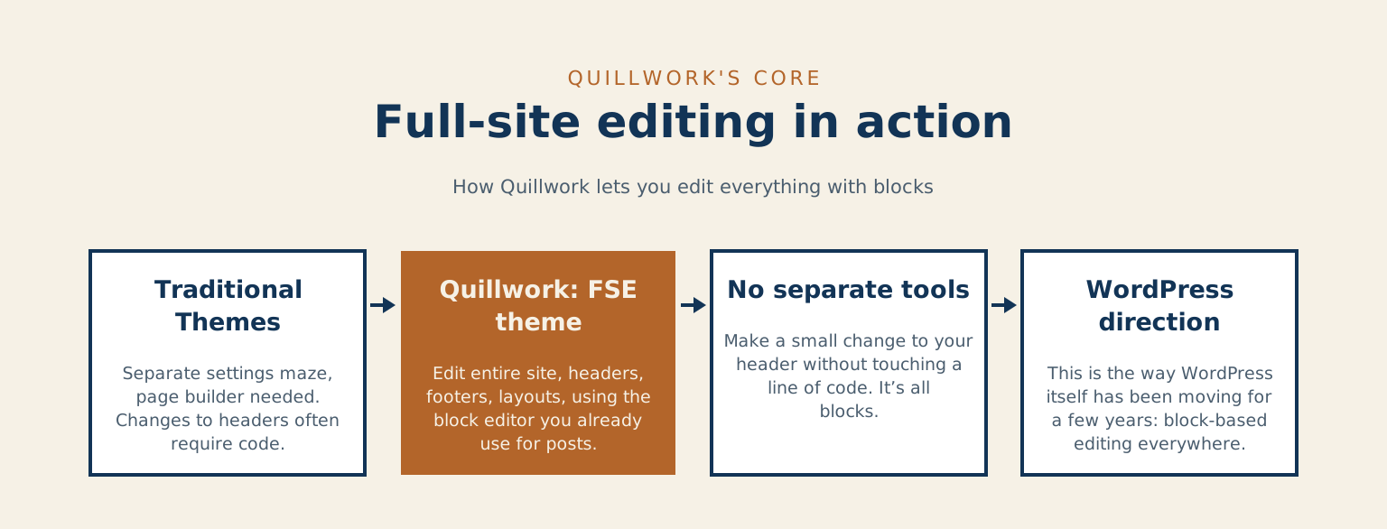
It is typography-first and editorial by design. Think of it as built for a writer's portfolio, a personal essay site, a small publication, or a studio that leads with type, the kind of site where the writing is the point and the design should get out of its way.
Why an editorial theme should lead with type
Years ago I watched someone paste the same 1,500-word article into two sites, one after the other, to decide which host to move to. Same words, both times. On the first she skimmed it in about a minute and shrugged. On the second she slowed down, actually read to the end, and told me it felt "more finished." Nothing had changed but the type and the spacing. That is the whole thing in one moment: how the words are set on the page changes how people read them, and people react to it without knowing that is what they are reacting to.
Nothing had changed but the type and the spacing.
The three typefaces
So Quillwork leads with type. Headings are set in Cormorant Garamond, a display serif with real character for titles. Body text is Newsreader, a face drawn specifically to be read at length without tiring your eyes. Its foundry describes it as intended for continuous on-screen reading. The interface bits, buttons, menus, small labels, use DM Sans, a clean sans-serif that doesn't compete for attention. Colour is deliberately restrained: a teal and a warm ochre on a cream background, enough to feel considered, not so much that it competes with your writing.
- Headings: Cormorant Garamond, a display serif
- Body text: Newsreader, drawn to be read at length
- Interface: DM Sans
- Palette: Teal and warm ochre on cream
- Accessibility: Built to WCAG 2.2 AA: skip links, visible focus, landmark roles
- Fonts: Self-hosted, no call to Google Fonts
- Languages: Right-to-left support, translation-ready
- Requires: WordPress 6.7 or newer, PHP 8.1 or newer, no plugins
- Price: Free, with no pro version
For anyone choosing a theme for a text-driven site, that is the question worth asking. Not "does it look nice in the screenshot," but "will a 2,000-word piece feel good to read on it." Quillwork is built to answer yes, and part of answering yes is making sure the piece reads for everyone, including the readers who see and click differently than you do.
Skip links, focus states, and landmarks
That is why accessibility was part of the plan before I wrote the first template, not a feature I added at the end to check a box. Quillwork ships with skip links so keyboard users can jump past the navigation, visible focus states so people can always see where they are on the page, and proper landmark roles so screen readers can make sense of the structure. It is built to WCAG 2.2 AA, the current accessibility standard. The directory listing names the same features: a skip link, visible focus states, landmark roles, and an explicit h1 on every template. The honest reason is simple. Some of your readers navigate with a keyboard. Others use a screen reader, or just need bigger text and better contrast. Building for them from the start costs little, while bolting it on later costs a rebuild. So I did it first.
Fonts, languages, and plugins
A few other things that matter more than they sound. The fonts are self-hosted, which means they load from your own site rather than calling out to Google Fonts. Nothing about your visitors gets sent to a third party just to render a headline, which is a small privacy win you get for free. The theme also supports right-to-left languages using modern CSS logical properties, and it is translation-ready. And it has zero plugin dependencies. It stands on its own, so you are not forced to install three other things to make it work.
Installing it, and why it stays free
Quillwork requires WordPress 6.7 or newer and PHP 8.1 or newer. To install it, open your WordPress dashboard, go to Appearance, then Themes, then Add New, and search for "Quillwork." Activate it and you are running. You can also see it in the directory here: wordpress.org/themes/quillwork. There is no account to create, no upsell, and no locked "pro" version waiting to charge you once you are hooked. It is free, and it stays free.
That last part is deliberate. I have been building on the web since 1996 and working in WordPress since 2007, and much of what I know I learned from other people who gave their work away, in forums and free plugins and at WordCamps where nobody was selling anything. Putting a well-made theme back into that directory, no strings attached, is one of the cleaner ways I know to pay that forward. I wrote more about working this way in Make a living giving it away, fifteen years on.
Common questions about Quillwork
Is Quillwork really free? Yes. There is no account to create and no locked "pro" version waiting behind it. It is free, and it stays free.
Who is Quillwork for? Writers, editors, and small studios that lead with type, from a personal essay site to a small publication. If you would rather have the site built for you, that is the writing and publishing work I do.
What do I need to run it? WordPress 6.7 or newer and PHP 8.1 or newer. If an older site needs a hand getting current first, rescue work is where I start.
Where Quillwork goes next
Quillwork is the first of a small line of free editorial themes I am building for This Is My URL. If you write on WordPress, or build sites for people who do, and you want a theme that treats the words as the main event, install it and take it for a spin. If you find a rough edge, I would genuinely like to hear about it.
When did you last give up on a long essay after a paragraph or two, and what about the page pushed you out?
And if you would rather have the whole site built for you instead of building it yourself, that is the work I do.
References
- Quillwork, WordPress theme directory
- Web Content Accessibility Guidelines (WCAG) 2.2, W3C
- Block themes, WordPress Theme Handbook
- Newsreader, Production Type
- Cormorant, Catharsis Fonts
- CSS Logical Properties and Values, W3C
Checked against the Quillwork directory page, WCAG 2.2, the block themes handbook, Newsreader, Cormorant and CSS Logical Properties, on 2026-10-11.